Dear Mr. Market:
It’s been a while since we’ve had to talk about you. The world has been focused on many changes which sometimes leaves you to quietly do your thing while we catch our breath. We’ve ushered in a new year, the United States has a new President and administration, and we’re finally seeing some light at the end of the tunnel with regards to the most surreal pandemic one could imagine.
How have you been… Mr. Market?
Up, down, sideways, and all over the place…That’s how.
Today we write you a quick note to share our all-time favorite chart as well as a reminder to all those investors who may fall prey to short-term memory lapses. The recent stock market sell-off is a great wake up call to the fact that markets obviously don’t just go up in a straight line. It’s a bit more than that though…
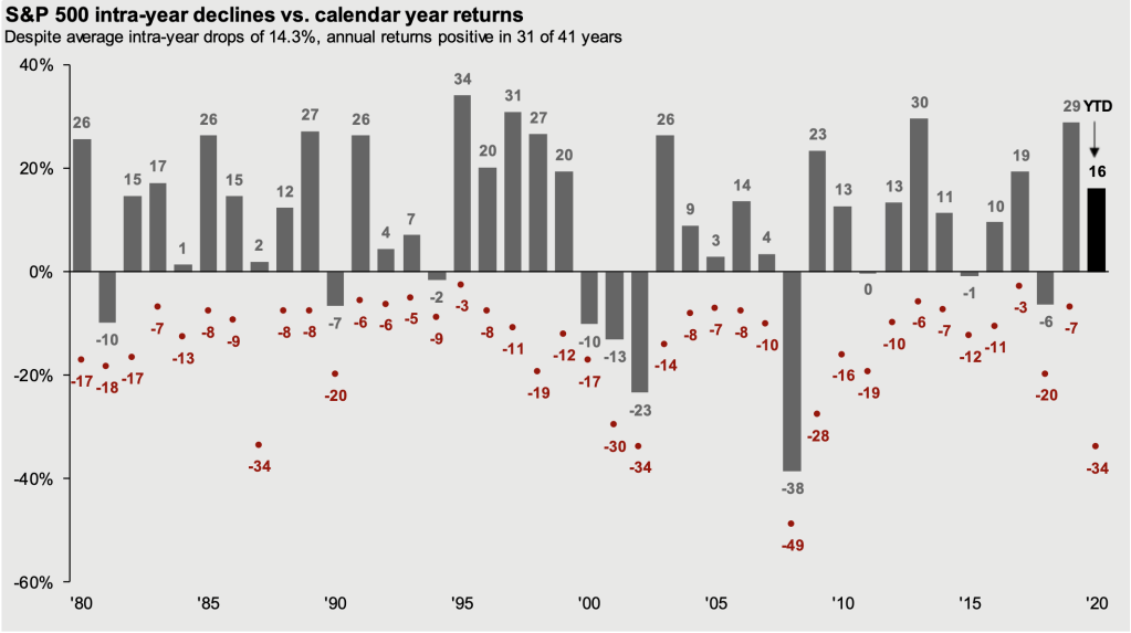
Below is our all-time favorite stock chart and we’re going to share why it’s important to look at this every so often.

The chart above comes from JP Morgan and gets updated every year. We’ve been showing this to My Portfolio Guide, LLC clients lately as a fantastic reminder of two things: (1) Regardless of all the worries, concerns, and major events, over time markets go up and have finished positive 31 out of the past 41 years, and (2) The stock market will average an intra-year drop from from peak to trough of at least -14%!
Each year tells its own story but it’s sometimes beneficial to go back and see the ending result (grey number) and remember how you may have felt emotionally when the stock market was down at some point in that year (red number). A years years really stand out to us in particular.
Look at 1987, where the market actually finished up that year although at one point it was down -34% and even dropped -22% in a single day! If you never went through that wild day click here to revisit it. Another stretch of time when many people actually have fond memories was right before the DotCom crash. The late 1990s seemed like one of those times where all you had to do was pick a stock that had technology associated with it and it went up. Sound familiar? Anyway, the ride seems smoother now but again, short-term memory is challenging for many of us. Look back at 1998 for an excellent example. The stock market finished up +27% but at one point was down -19% (basically near bear market territory). Is that how you remember it? Lastly, not too long ago, in 2017, we literally experienced the least volatile year in the history of the stock market. In a year that seemingly could not get rattled even by brutal hurricanes, unorthodox Presidential tweeting, major wild fires, and a nuclear threat from North Korea…the market finished up calmly at +10% (although was down -11% without anyone even remembering that).
Yesterday the Nasdaq (tech heavy index) sold off -3.5% for its worst day since last October. What we’re seeing the past few days of this young year should not panic you if you’ve learned anything from this valuable chart. Yes…we’re going to see some volatility, so prepare your mind for it now instead of while you’re in the middle of the storm.

